Bakery On MainTrüeBar Packaging
Role: Design/CopyMarketing Manager: Sara LeFebvre
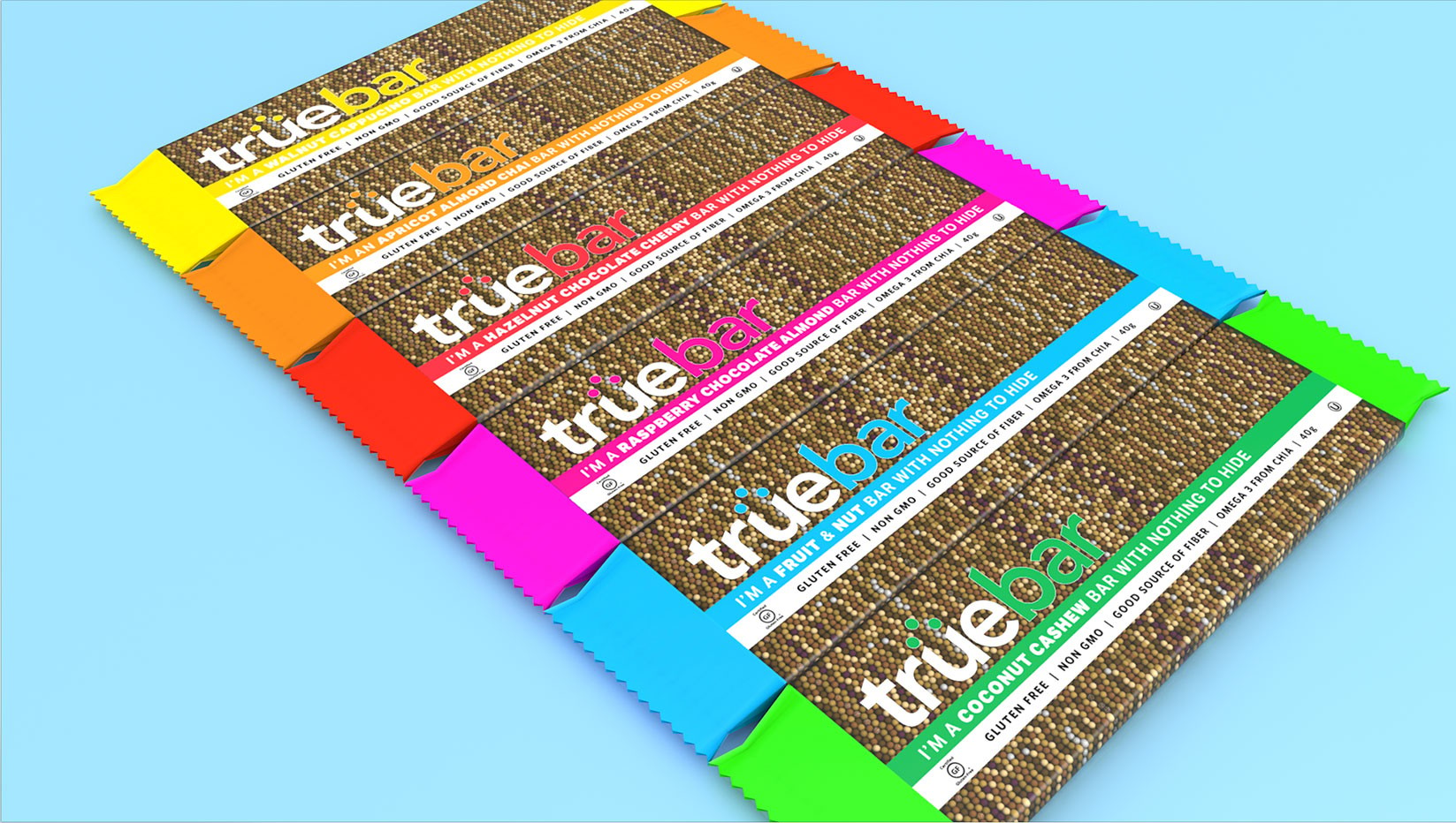
East Hartford, Connecticut. TrueBar was a line of six, all-natural, Certified Gluten Free flavors with the purpose of consumer clarity. Both the title and the approach were designed to be simple, but incredibly effective on the retail shelf.

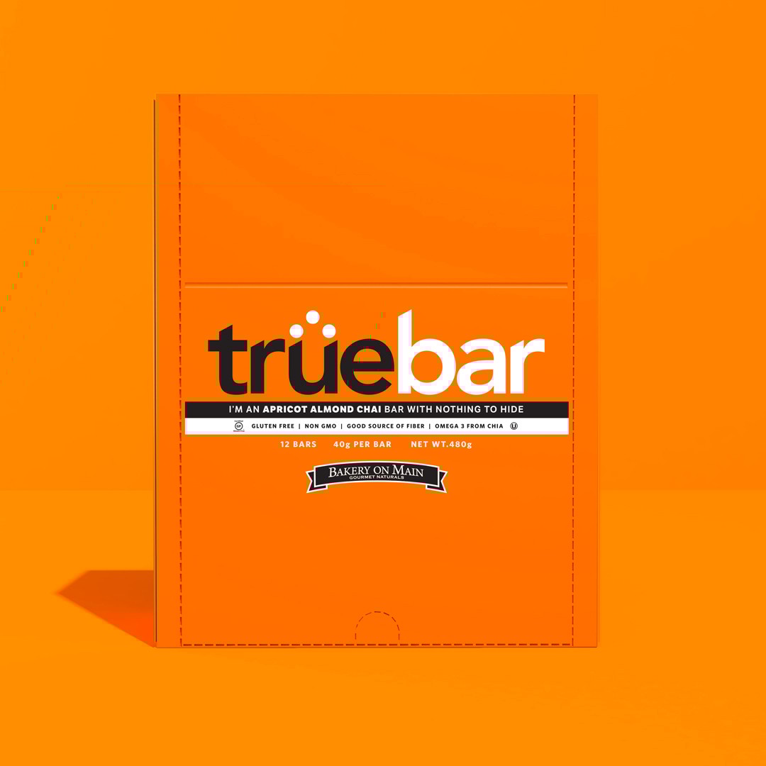
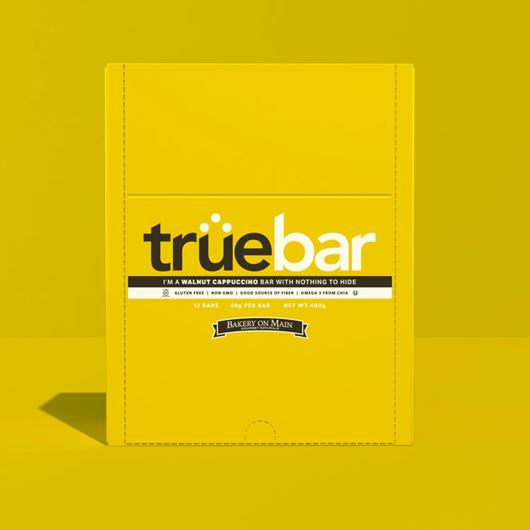
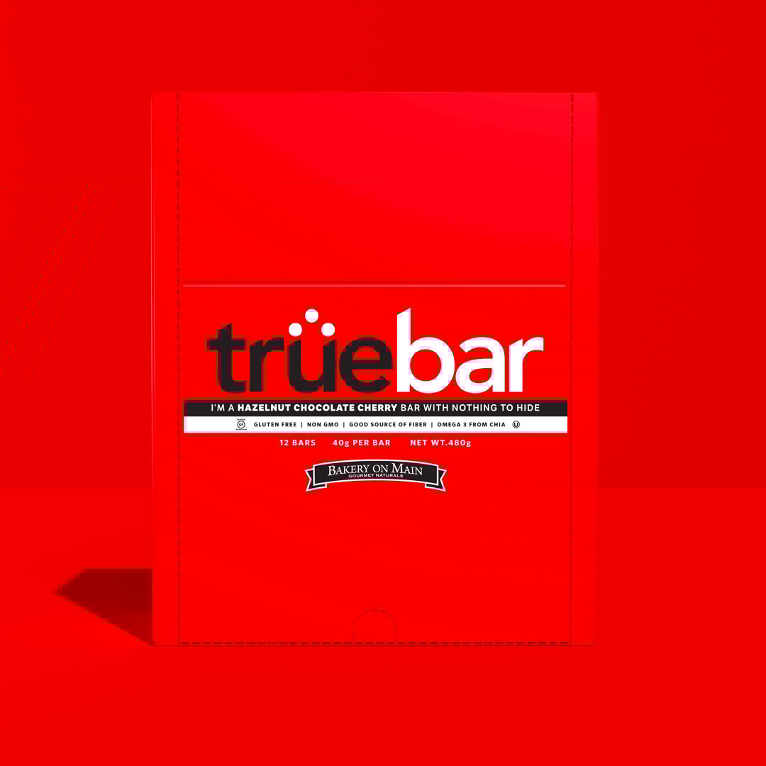
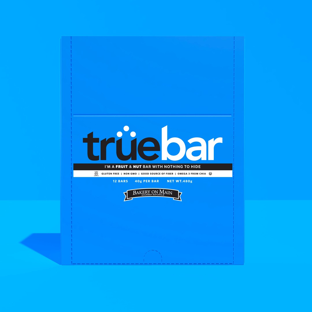
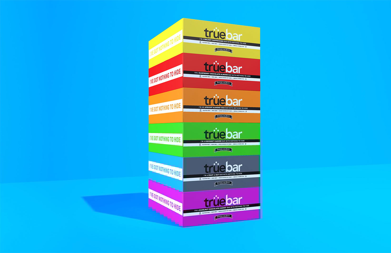
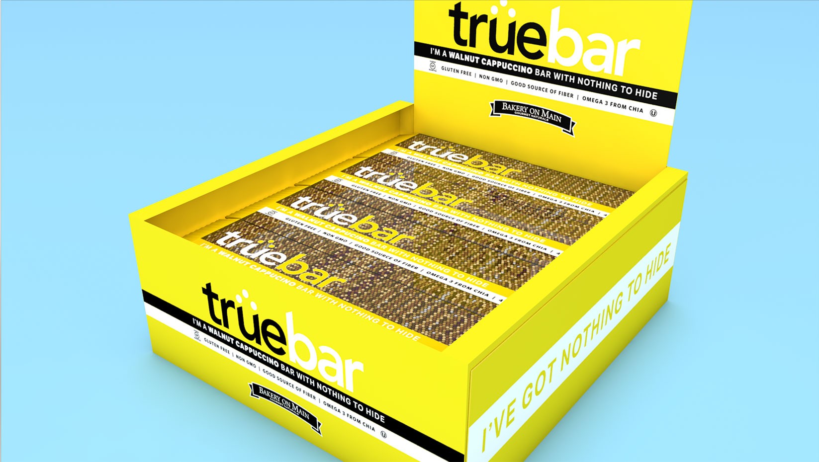
Carton
Bold, simple approach built for attention. When aligned next to one another, their vibrant color spectrum demanded attention. This was one of the most fun sights to see when walking down the aisle. The other was the confident bits of dialogue threaded around the design to provide a look into the experience.
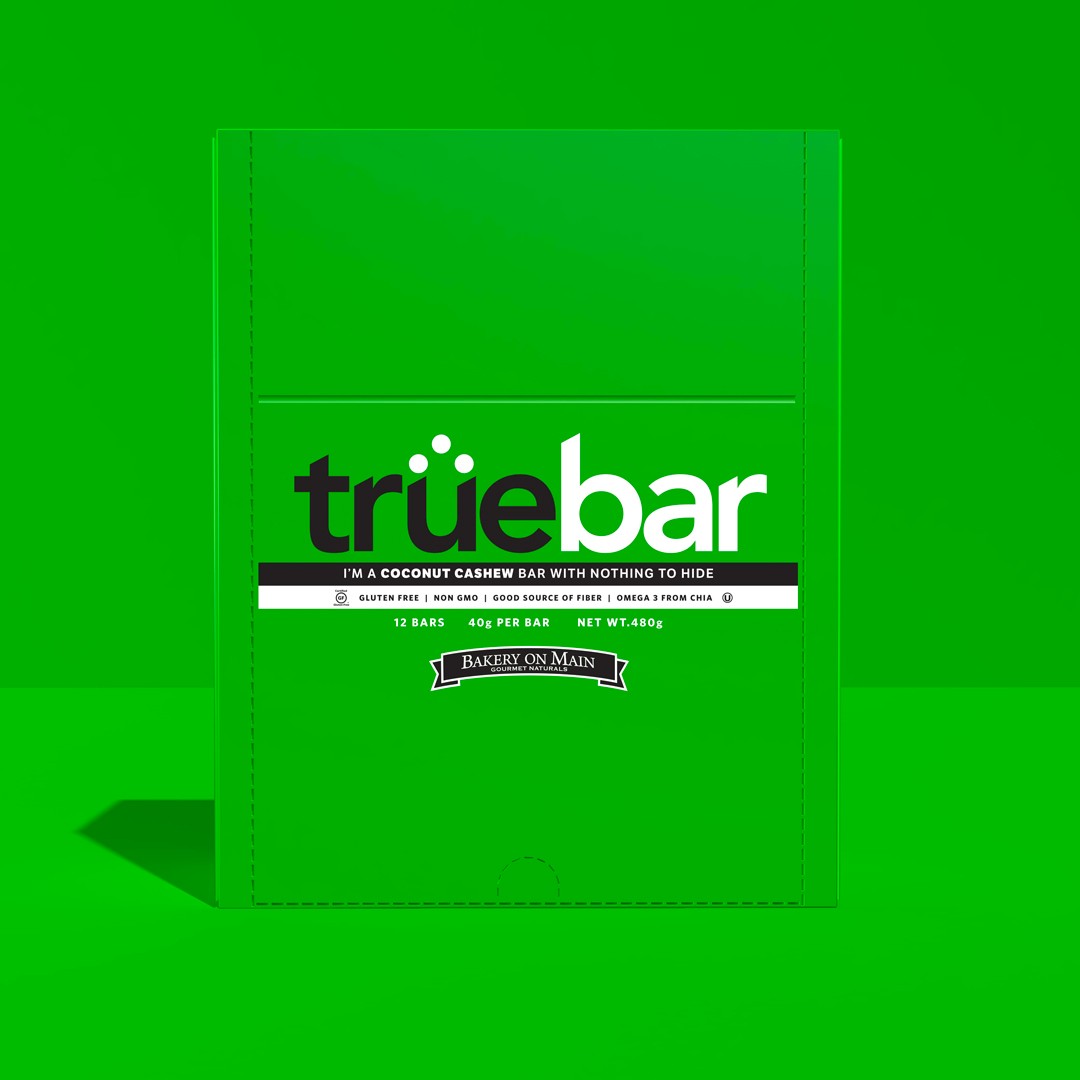
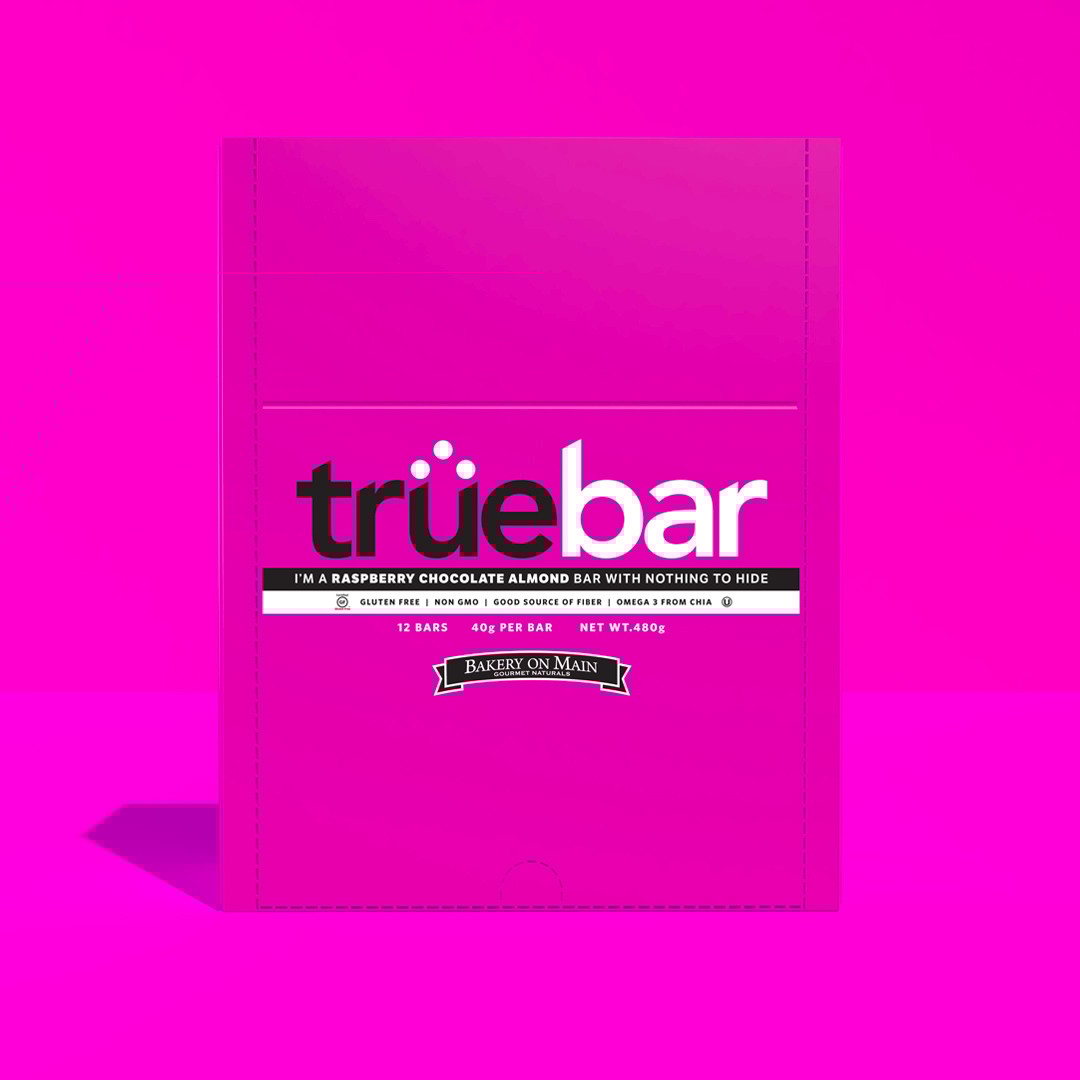
Sleeves
Putting it all out there with a translucent sleeve. The packaging was meant to be as "true" as the product so a transparent design approach was chosen. It allowed a clear and simple way for the consumer to see exactly what they were getting.
Up Next:
Triumph MotorsProduct Packaging
View Project →
Bakery On MainTrüeBar Packaging
Role: Design/CopyMarketing Manager: Sara LeFebvre
East Hartford, Connecticut. TrueBar was a line of six, all-natural, Certified Gluten Free flavors with the purpose of consumer clarity. Both the title and the approach were designed to be simple, but incredibly effective on the retail shelf.
Carton
Bold, simple approach built for attention. When aligned next to one another, their vibrant color spectrum demanded attention. This was one of the most fun sights to see when walking down the aisle. The other was the confident bits of dialogue threaded around the design to provide a look into the experience.
Sleeves
Putting it all out there with a translucent sleeve. The packaging was meant to be as "true" as the product so a transparent design approach was chosen. It allowed a clear and simple way for the consumer to see exactly what they were getting.
Up Next:
Triumph MotorsProduct Packaging
View Project →