Indian MotorcycleFTR 1200 Brand Identity
Role: Art Director, DesignerCreative Director(s):Joe Sutter, Aaron Frank, Brian PettitCopywriter: Aaron Frank
The FTR 1200 product launch and brand revolve around innovation and risk tolerance that is currently redefining American motorcycling - proven through products like the FTR 1200 and programs like American Flat Track Racing.
Launch Look, Tone, Feel
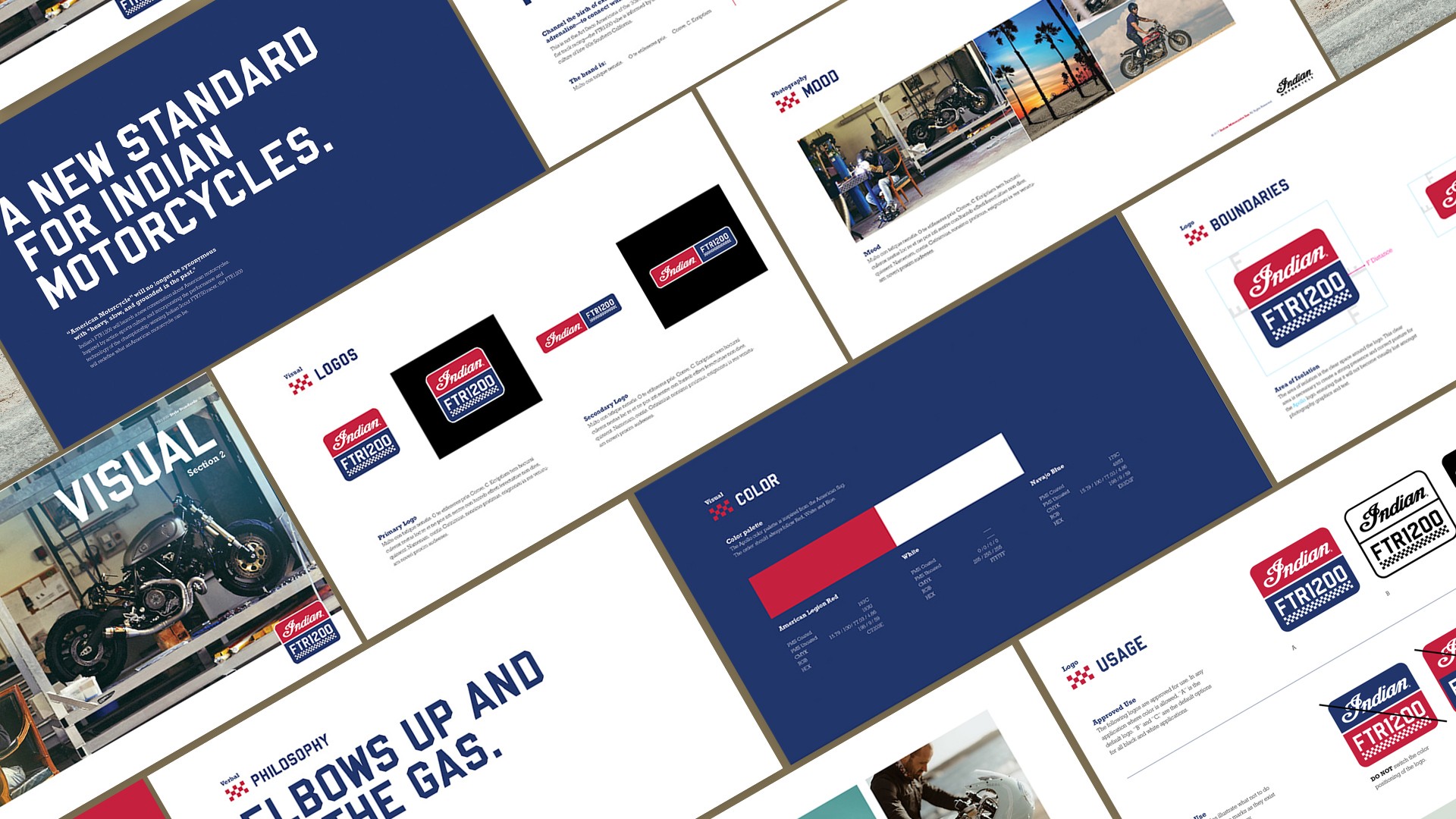
Led the visual development for the FTR1200 launch— a pivotal moment for Indian Motorcycle. We introduced Navajo Blue to boldly claim the American color palette, setting the brand apart from competitors. I created a comprehensive style guide with logo, color system, and photographic direction—foundational assets still in use today. Here's where it all began, and how it’s evolved since.
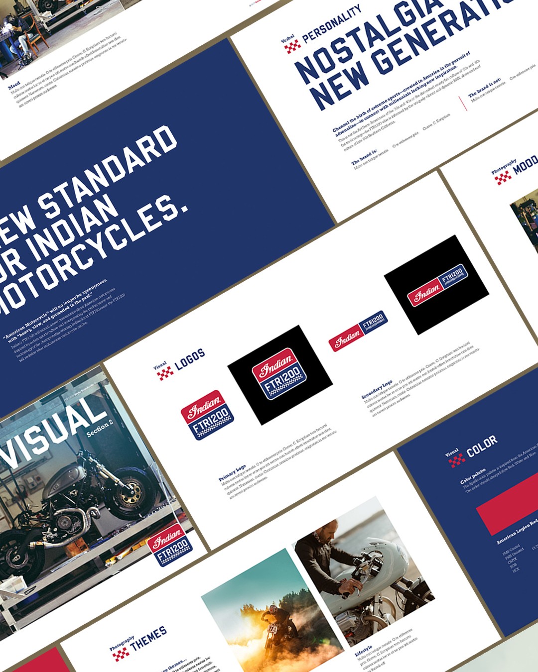
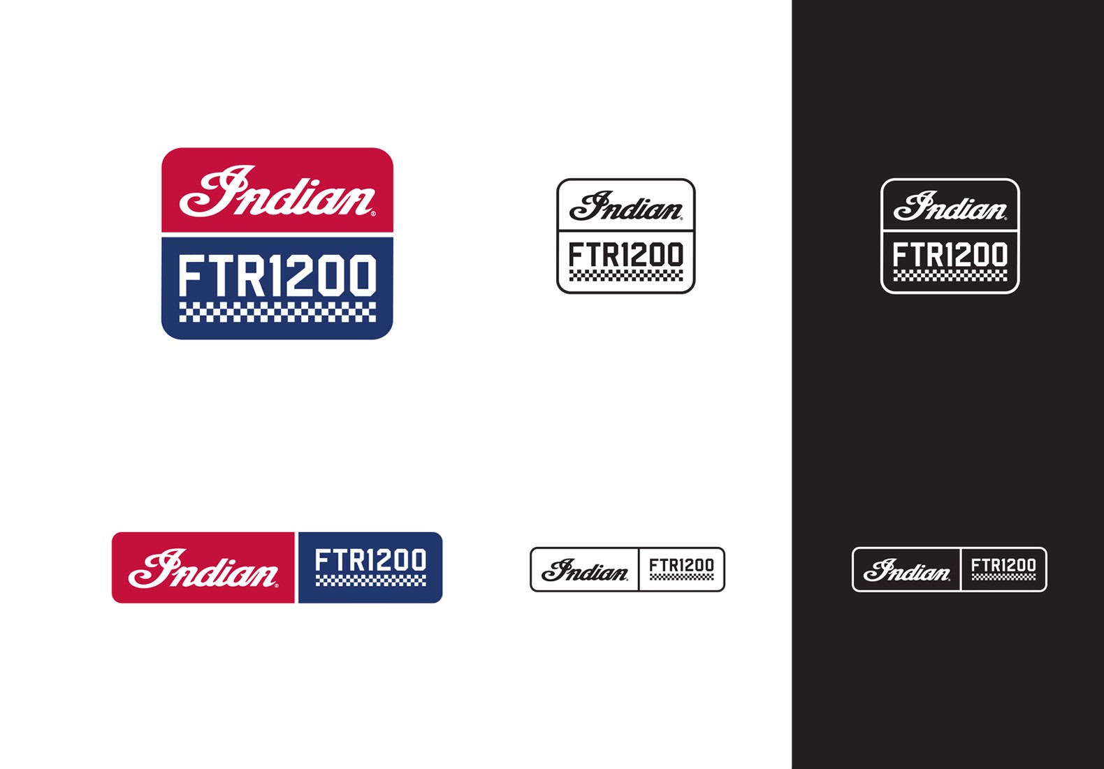
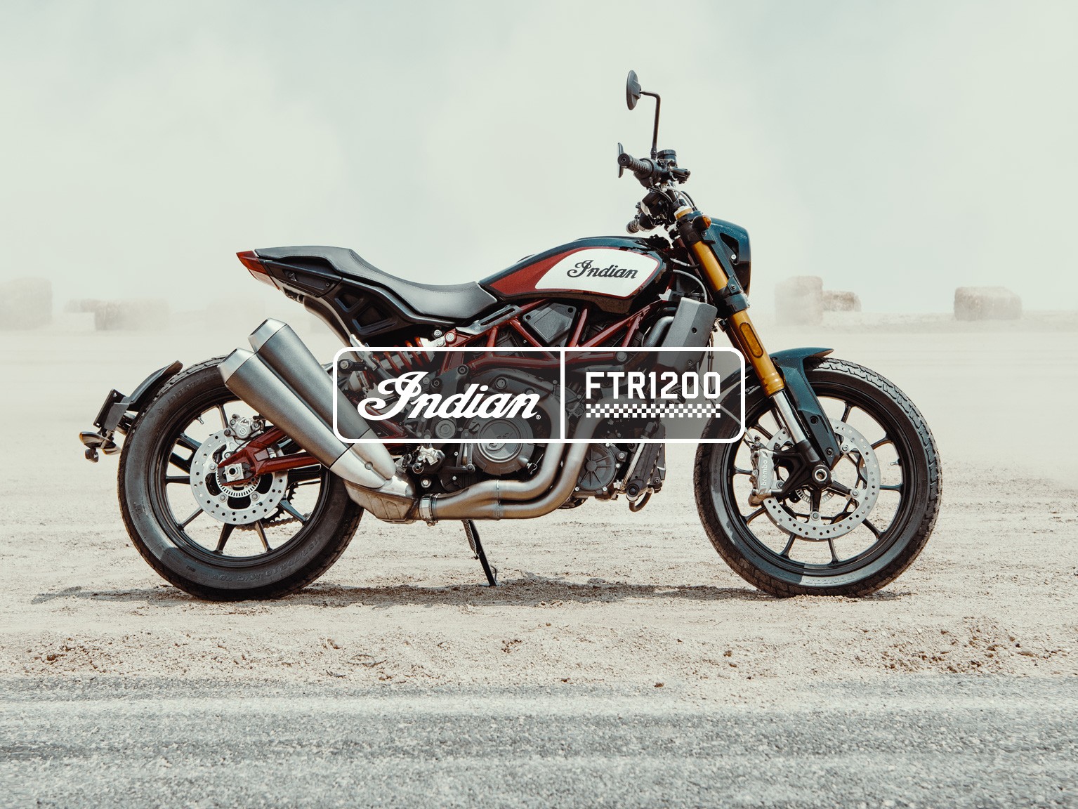
The Logo
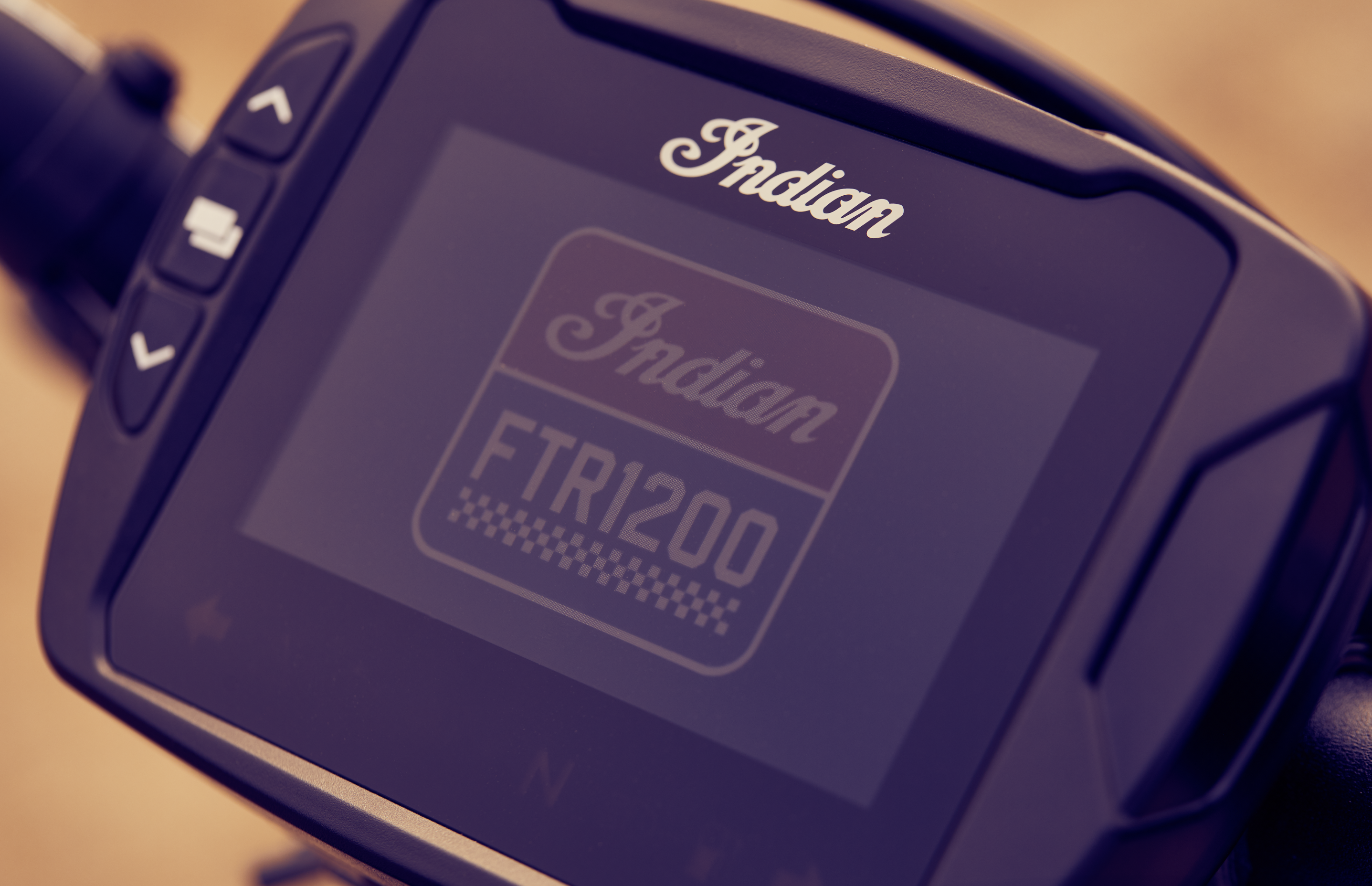
As a designer, I’ve always aimed to create something lasting. The FTR1200 mark—simple, bold, and inspired by classic fuel tank badging and flat track racing—was one of those rare opportunities. While it didn’t land on the tank, it proudly lives on the startup screen and other key details of the bike.
Process: Origin Story
The FTR1200 wasn't always called that. It was originally dubbed the Tracker 1200R. Early development of what would be finalized as the FTR1200 began as the Tracker 1200R. The preliminary logo exploration started here until the final name was official. You'll notice a slightly warmer color palette. This was the original color palette that incorporated the existing Heritage taupe and maroon colors before we pitched stark white for a true "Red, White and Blue." In addition, some other slight brightness variations applied to the examples below.
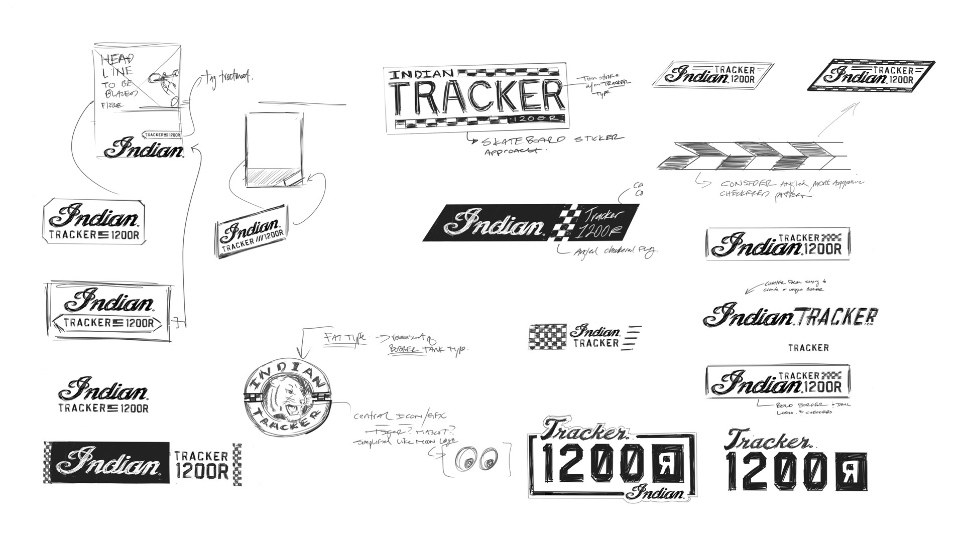
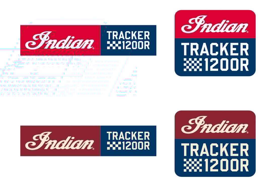
We wanted to use the mechanics of the mark to become a brand anchor for all creative applications.
We explored many different options before landing on the base white footer that would contain the tagline, "Be Legendary." We ran it through the center axis line of the mark to give it purpose and flexibility. It resulted in a really solid base structure we could build from.
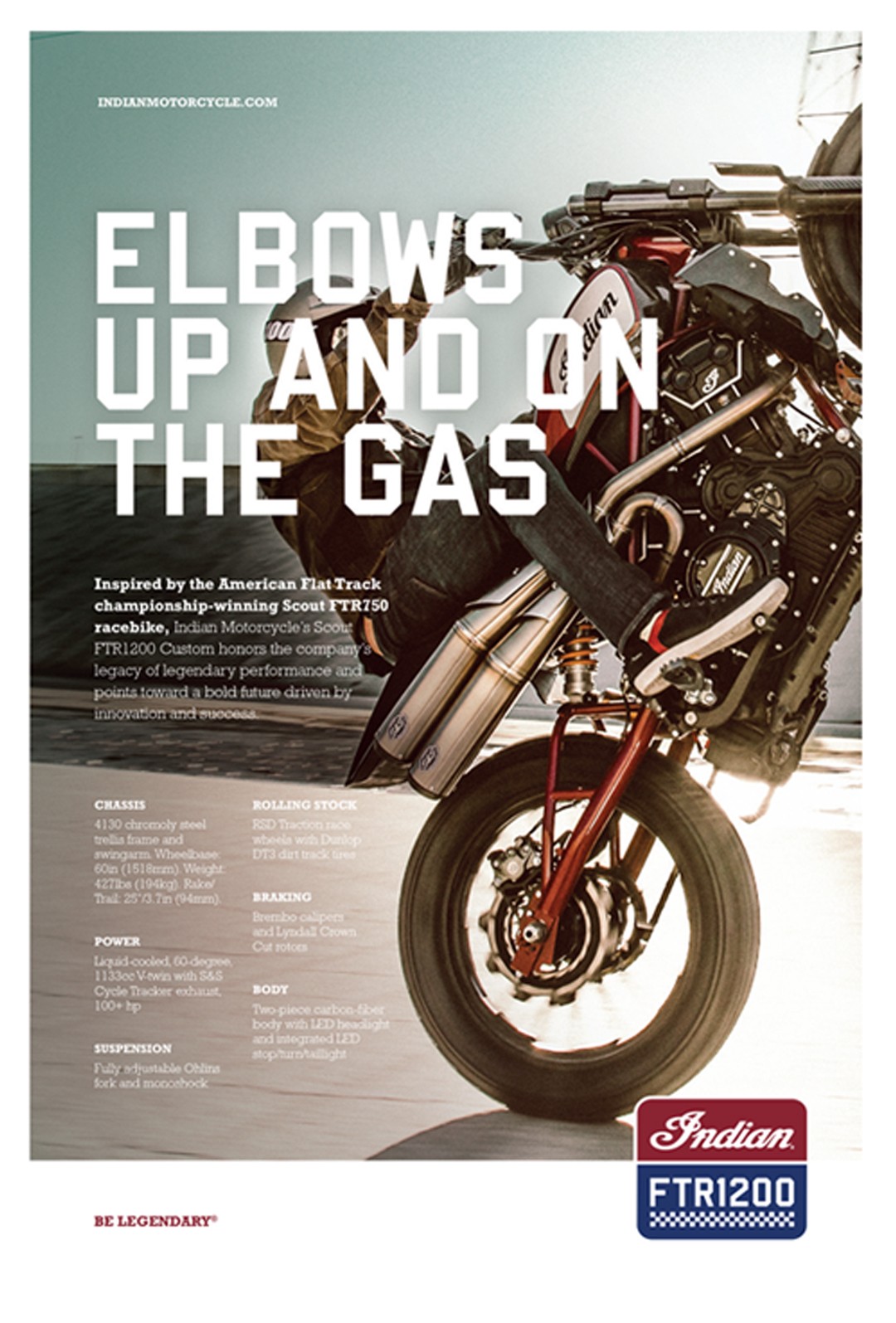

Exhibit Space
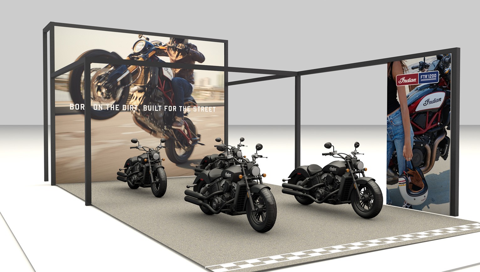
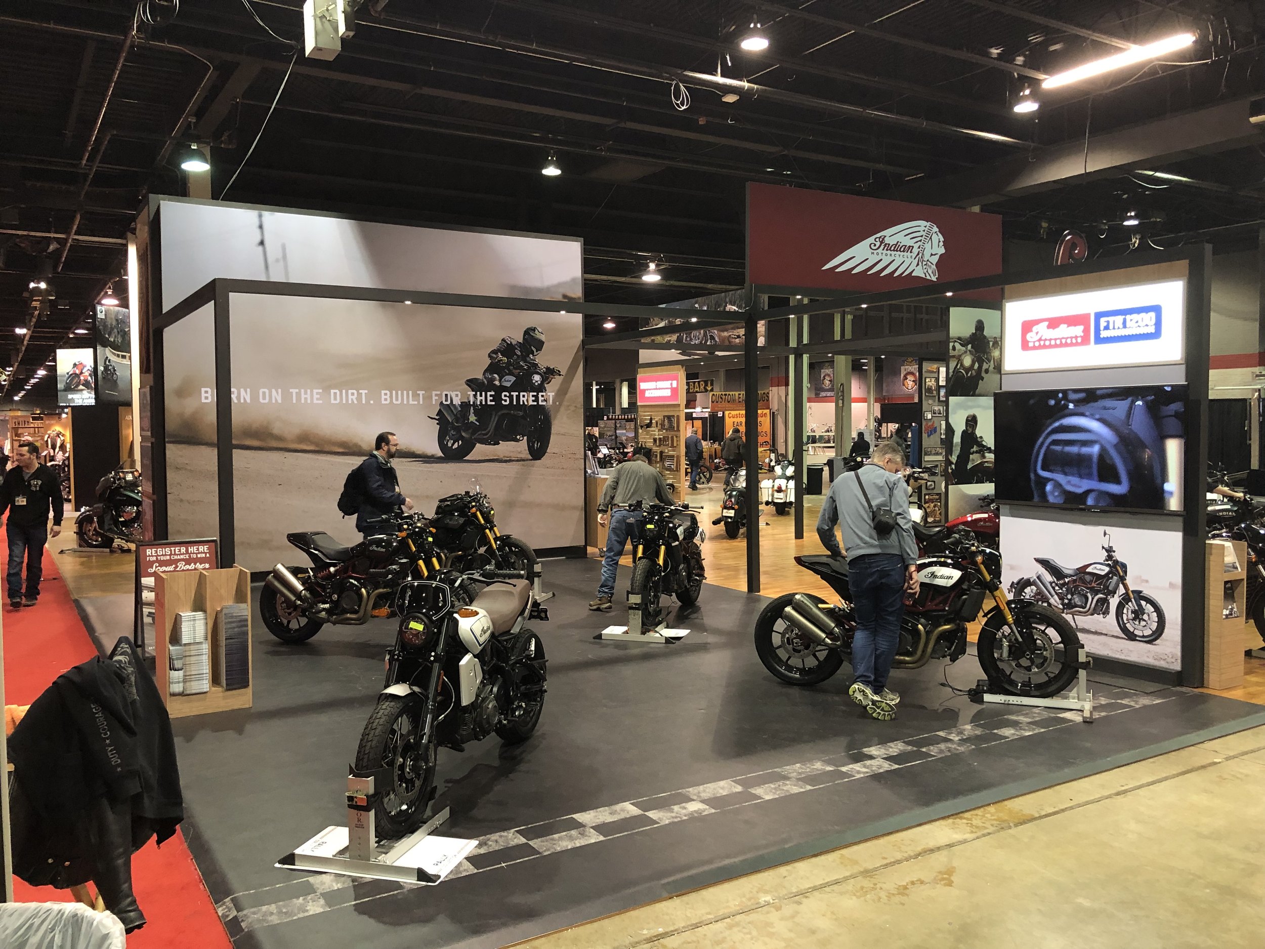
In the exhibit space, we used bold lifestyle imagery and gritty headlines to wrap the consumer experience together. For the International Motorcycle Show (IMC) in Chicago, we made the quadrant of the footprint for FTR1200 to be open and airy. It offered a street lifestyle feel that encouraged attendees to wrap their legs around the bikes to get a first-hand feel. Below is a preliminary rendering and also what the final product resulted in.
Up Next:
GMRBrand Identity
View Project →
Indian MotorcycleFTR 1200 Brand Identity
Role: Art Director, DesignerCreative Director(s): Joe Sutter, Aaron Frank, Brian PettitCopywriter: Aaron Frank
The FTR 1200 product launch and brand revolve around innovation and risk tolerance that is currently redefining American motorcycling - proven through products like the FTR 1200 and programs like American Flat Track Racing.
Launch Look, Tone, Feel
Led the visual development for the FTR1200 launch— a pivotal moment for Indian Motorcycle. We introduced Navajo Blue to boldly claim the American color palette, setting the brand apart from competitors. I created a comprehensive style guide with logo, color system, and photographic direction—foundational assets still in use today. Here's where it all began, and how it’s evolved since.
The Logo
As a designer, I’ve always aimed to create something lasting. The FTR1200 mark—simple, bold, and inspired by classic fuel tank badging and flat track racing—was one of those rare opportunities. While it didn’t land on the tank, it proudly lives on the startup screen and other key details of the bike.

Process: Origin Story
The FTR1200 wasn't always called that. It was originally dubbed the Tracker 1200R. Early development of what would be finalized as the FTR1200 began as the Tracker 1200R. The preliminary logo exploration started here until the final name was official. You'll notice a slightly warmer color palette. This was the original color palette that incorporated the existing Heritage taupe and maroon colors before we pitched stark white for a true "Red, White and Blue." In addition, some other slight brightness variations applied to the examples below.
We wanted to use the mechanics of the mark to become a brand anchor for all creative applications.
We explored many different options before landing on the base white footer that would contain the tagline, "Be Legendary." We ran it through the center axis line of the mark to give it purpose and flexibility. It resulted in a really solid base structure we could build from.
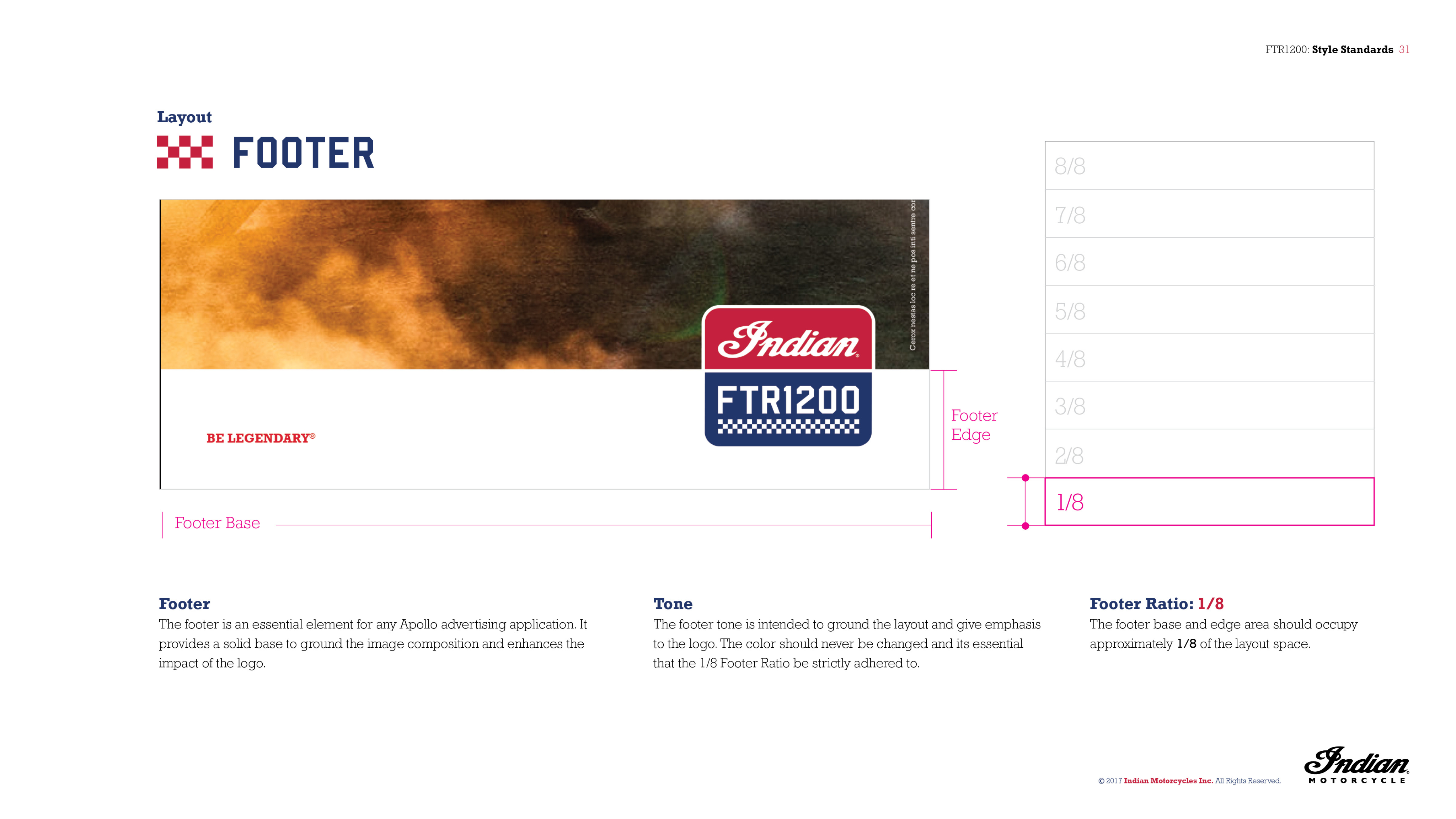
Exhibit Space
In the exhibit space, we used bold lifestyle imagery and gritty headlines to wrap the consumer experience together. For the International Motorcycle Show (IMC) in Chicago, we made the quadrant of the footprint for FTR1200 to be open and airy. It offered a street lifestyle feel that encouraged attendees to wrap their legs around the bikes to get a first-hand feel. Below is a preliminary rendering and also what the final product resulted in.
Up Next:
GMRBrand Identity
View Project →
Indian MotorcycleFTR 1200 Brand Identity
Role: Art Director, DesignerCreative Director(s): Joe Sutter, Brian Pettit, Aaron FrankCopywriter: Aaron Frank
The FTR 1200 product launch and brand revolve around innovation and risk tolerance that is currently redefining American motorcycling - proven through products like the FTR 1200 and programs like American Flat Track Racing.
Launch Look, Tone, Feel
Led the visual development for the FTR1200 launch— a pivotal moment for Indian Motorcycle. We introduced Navajo Blue to boldly claim the American color palette, setting the brand apart from competitors. I created a comprehensive style guide with logo, color system, and photographic direction—foundational assets still in use today. Here's where it all began, and how it’s evolved since.
The Logo
As a designer, I’ve always aimed to create something lasting. The FTR1200 mark—simple, bold, and inspired by classic fuel tank badging and flat track racing—was one of those rare opportunities. While it didn’t land on the tank, it proudly lives on the startup screen and other key details of the bike.
Process: Origin Story
The FTR1200 wasn't always called that. It was originally dubbed the Tracker 1200R. Early development of what would be finalized as the FTR1200 began as the Tracker 1200R. The preliminary logo exploration started here until the final name was official. You'll notice a slightly warmer color palette. This was the original color palette that incorporated the existing Heritage taupe and maroon colors before we pitched stark white for a true "Red, White and Blue." In addition, some other slight brightness variations applied to the examples below.
We wanted to use the mechanics of the mark to become a brand anchor for all creative applications.
We explored many different options before landing on the base white footer that would contain the tagline, "Be Legendary." We ran it through the center axis line of the mark to give it purpose and flexibility. It resulted in a really solid base structure we could build from.
Exhibit Space
In the exhibit space, we used bold lifestyle imagery and gritty headlines to wrap the consumer experience together. For the International Motorcycle Show (IMC) in Chicago, we made the quadrant of the footprint for FTR1200 to be open and airy. It offered a street lifestyle feel that encouraged attendees to wrap their legs around the bikes to get a first-hand feel. Below is a preliminary rendering and also what the final product resulted in.
Up Next:
GMRBrand Identity
View Project →